


Talk:Manicule/GA1
Add topicGA review
[edit]The following discussion is closed. Please do not modify it. Subsequent comments should be made on the appropriate discussion page. No further edits should be made to this discussion.
| GA toolbox |
|---|
| Reviewing |
Article (edit | visual edit | history) · Article talk (edit | history) · Watch
Nominator: Rjjiii (talk · contribs) 22:07, 15 March 2026 (UTC)
Reviewer: DrOrinScrivello (talk · contribs) 18:09, 24 March 2026 (UTC)
Hello, I'll take on this review. I once used the Cincinnati Type Foundry manicule in some vintage-style chalkboard art and have had a soft spot for it since. The article looks to be in great shape after an initial read-through; I should have some (minor) prose comments for you by later today or tomorrow. DrOrinScrivello (talk) 18:09, 24 March 2026 (UTC)
Prose review
[edit]Most of these comments are fairly minor. I'll try to indicate when they are merely suggestions and not necessary to pass the review. I've already made a few small and hopefully uncontroversial copyedits, but feel free to revert anything you disagree with.
Lead
[edit]- Overall, the lead looks good. It's possible I'll have some comments on breadth after the rest of the review, but I doubt it.
- The manicule, derived from the Latin manicula, or 'little hand', has been known by many other names, I think you should either adjust the wording here ("The term manicule was derived from the Latin manicula, or 'little hand', though it has been known by many other names") or put the derived from the Latin manicula, or 'little hand' bit inside a parenthetical, which would make it more initially clear it's the terminology being discussed.
- Done, Rjjiii (talk) 11:48, 28 March 2026 (UTC)
- Suggest linking "annotated" to annotation
- Done, Rjjiii (talk) 11:48, 28 March 2026 (UTC)
Terminology
[edit]- With the bit that begins with Sherman writes that three are likely conflations with other terms, I recommend a structure similar to, "The first of these, the pilcrow..." then "The second, the maniple..." and "The third, indicule,...". Just a personal preference, but I think it would make it read clearer.
- Done, Rjjiii (talk) 11:48, 28 March 2026 (UTC)
History
[edit]- While the pages on a scroll are written on the same long length of papyrus or parchment, Are they still considered "pages" when in a scroll format? Maybe "While the text on a scroll is written..."?
- I think the columns of text running perpendicular to the flow of a scroll are still pages, but I've used your suggested wording to avoid confusion. Rjjiii (talk) 11:55, 28 March 2026 (UTC)
- Stallybrass argues that the codex encouraged discontinuous reading of a text I'm of the opinion that the emphasis is unnecessary here, but if you decide to keep it, the MOS recommends using
{{em}}for accessibility.- Removed emphasis, Rjjiii (talk) 11:55, 28 March 2026 (UTC)
- and using the same Gothic rotunda font This seems like a bit of an WP:EGG link to me. My first thought was to link it to Rotunda (script), but that's not the same as the typeface you're describing. I'm open to other arguments, but I'd say lose the link.
- Lost the link, Rjjiii (talk) 11:55, 28 March 2026 (UTC)
- Some gravestones included manicules pointing upwards, towards "the hope of heaven" I think this quote should be attributed somehow. EDIT: See the source review below before putting too much time into this. DrOrinScrivello (talk) 16:23, 26 March 2026 (UTC)
- Good catch, as noted below, it's now cited to McPharlin. Rjjiii (talk) 11:55, 28 March 2026 (UTC)
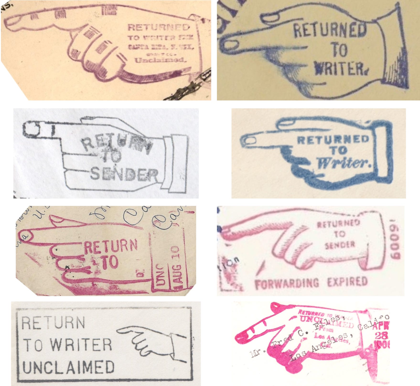
- a graphical indicator meaning "Return to Sender"
I don't think the phrase needs to be capitalized.EDIT: While I can't access the source cited at the claim, in doing my spot check I've just seen that the Saturday Evening Post used the same capitalization, so I'll retract this comment. DrOrinScrivello (talk) 16:09, 26 March 2026 (UTC)- It's also on page 13 here: "
Hasler was particularly interested in their use in commercial and industrial settings, and they come to play a crucial role in the visual vocabulary of advertising—as well as in public signage (most obviously in “fingerposts”), and in a wide range of official documents (including the “Return to Sender” stamp used by the US Postal Service).
" The actual stamps capitalize every letter, so I'm not sure why the sources captialize just two. I've copied the formatting used by the source, but if there is a MOS issue, I don't think it affects verifiability to change the capitalization. Rjjiii (talk) 11:44, 28 March 2026 (UTC)
- It's also on page 13 here: "
Usage
[edit]- Even in the first few centuries of use, it was used to draw attention to specific text, In my opinion, the use of "even" here suggests that this is a surprising fact, when I don't necessarily think it is. Suggest re-wording to "From its first few centuries of use..." or "Since the beginning of its usage..." (or something similar that's supported by the sources), but I won't argue if you disagree.
- and manicules to indicate terms that can be cross-referenced, or looked up under another entry. Cross-referencing is mentioned in the previous paragraph. Suggest moving the link and short definition there.
Computer cursor
[edit]- Remove second link to graphical user interface
I think that's it for prose. Like I said, pretty much just nit-picky stuff; it's a well-written article. I'll probably begin the source review tomorrow at some point. @Rjjiii: throwing you a ping since I haven't yet, but don't feel the need to rush. DrOrinScrivello (talk) 22:23, 25 March 2026 (UTC)
- Thanks for the feedback. I'll start going through it. Let me know if you need quotes from or copies of any of the sources. Rjjiii (talk) 01:39, 26 March 2026 (UTC)
- Sounds good, thanks. I actually got Houston 2013 from my library (looking forward to reading the rest of it), and between that and online sources I should be able to do a satisfactory spot check, but I'll let you know if that changes. DrOrinScrivello (talk) 14:35, 26 March 2026 (UTC)
Source review
[edit]- Sourcing in general looks good, with the possible exception of I Love Typography, which appears to be a blog. Do you know if the author is a subject matter expert?
- @DrOrinScrivello: I'm citing Boardley as a subject matter expert there. That blog post mentions and is related to his 2019 book Typographic Firsts, published by Bodleian Library, University of Oxford. Rjjiii (talk) 11:45, 28 March 2026 (UTC)
- I'm going to spot check ref #s 2, 6, 11, 14, 26, 32, 35, 47, 55, and 61 as of this revision.
- 2.

- 6.
- 11.
- 14. (a) (b) (c)
- 26.
- 32. (a)
 This claim is supported by the cited source, but in looking at this in conjunction with my comment upthread about attributing the quote, I decided to look at who is actually being quoted. The cited source says By some accounts, the upward-pointing version represents "the hope of heaven," whereas the downward-pointing version represents "God reaching down for the soul" and is associated with untimely death (Powell, 2018). Their "some accounts" seems to just be Powell 2018, a ThoughtCo article/listicle that makes a lot of claims about gravestone symbolism but doesn't cite any sources itself, and ThoughtCo is yellow on WP:RSP. Do you think there's any chance of finding another source for this claim? (b)
- Update: I've been reading through Shady Characters, and on page 183 he writes, Manicules even appeared on nineteenth-century gravestones, pointing "electrically heavenward," as Paul McPharlin put it, so that may work as a substitute should you want to use it. DrOrinScrivello (talk) 15:24, 27 March 2026 (UTC)
- Ah, you're right, and since the Wikipedia article already cites Paul McPharlin's work, I've revised that section to cite McPharlin and to be more specific. Rjjiii (talk) 11:47, 28 March 2026 (UTC)
- 35.
- 47.
- 55.
- 61.
Pretty spotless spot check. No issues at all with verifiability, just the couple of sourcing questions to address. DrOrinScrivello (talk) 16:09, 26 March 2026 (UTC)
- @DrOrinScrivello, thanks for all of the feedback! I've replied to some specific points above. If you disagree on I Love Typography, I'll trim that section down. For "Return to Sender", I just used the formatting from the source, but I can change it if the Manual of Style prohibits the formatting. Rjjiii (talk) 18:50, 29 March 2026 (UTC)
- All of the above changes look good, thanks for being open to my suggestions. I'm satisfied with your argument regarding Boardley as a subject matter expert. Image review, breadth, and miscellaneous criteria review to follow shortly. DrOrinScrivello (talk) 13:15, 30 March 2026 (UTC)
Image review, misc criteria
[edit]- The article is well illustrated, well captioned, and properly licensed. I think this is my first GA review where the images already had alt text, which while not a requirement I always recommend, so thank you for that.
- The article is stable and written from a neutral perspective. The only things flagged by Earwig were quotes, and no other copyright concerns were detected during my spot check.
- Having now read through a number of the article's sources, I believe the article to be a thorough examination of its subject without going into excessive detail or omitting any significant coverage. The article's talk page demonstrates previous efforts at honing the focus which I think were largely successful.
And with that, I'm satisfied that the article meets the GA criteria, and am happy to pass it. Congratulations to Rjjiii and everyone else who has worked on it! DrOrinScrivello (talk) 13:38, 30 March 2026 (UTC)
| GA review (see here for what the criteria are, and here for what they are not) |
|---|
|
|
Overall: |
 · ·  · ·  · ·  |