Cloudflare fetched the original article and streamed it through HTMLRewriter to apply an entirely new visual system without rebuilding the source page.
// request.cf · coarse context
A page that knows where it met you.
Only coarse request metadata is shown. This demo does not display or persist visitor IP addresses.
This is an archive of past discussions on Wikipedia:Graphics Lab, for the period 2025. Do not edit the contents of this page. If you wish to start a new discussion or revive an old one, please do so on the current main page.
As a followup to my previous question, I need some additional assistance with a routemap
Latest comment: 8 months ago2 comments1 person in discussion
The routemap in question is at Template:The Stourbridge Line and viewing it shows two errors which I cannot fix. The first is an alignment issue on the main line between the Brown Street to White Mills sections where 'SHI1+r' appears to be the wrong icon to use. I cannot find a better one.
The second is a small chunk which seems to be missing from the icon 'BS2r' as shown just above the passing siding above Brown Street. Not sure what's going on there.
Thank you for any help Kether83 (talk) 03:54, 1 December 2025 (UTC)
I have fixed this issue with the help of Laberinto.app which is an online bsicon generator. At this point I just wish there were a thin line grade crossing icon to use for Brown St. but it looks like there just isn't one.
Kether83 (talk) 15:16, 1 December 2025 (UTC)
Hello, I need help displaying a map properly; I have an Openstreetmap relation, just can't get it to show up in the article.
Latest comment: 8 months ago8 comments2 people in discussion
@Kether83: on OpenStreetMap, I have added Q7620588 to the relation and removed it from the way (I message Veronica_G on there and they said they didn't finish the way or something).
I have a small followup and am not sure if this is the right place to ask - I created a routemap for this article as well but am having trouble with a couple of icons, as shown: Template:The Stourbridge Line
Hi Kether83. I suggest posting a new Help desk desk question, and include the exact problems.
For example: I can see the problematic gap (derailment!) between White Mills Road and Brown Street, but did you want three sidings or switchbacks (as used)? Maybe I can learn the fixes by reading Wikipedia:Route_diagram_template, bit I may get stuck - it is complicated :-(.
The current map of MST counties in ND is awkward because it doesn't show the rest of the state at all; if you don't know the geography well at all, you won't know if they're farther west or east, and even if you know this, you won't know if they're farther north or south. Could you take the typical locator map and highlight the MST counties with the same colouration? This way we'd get the whole state, so it's easy to see where in the state the MST counties are found. -- Nyttend (talk) 18:58, 13 November 2025 (UTC)
1) Siwel is not a reliable source and what's in it doesn't look anything like what you're suggesting. 2) This self-declared "republic" (by a handful of people in France) shouldn't be given UNDUE weight by making appear as though it's real. What's in the article is already a stretch. M.Bitton (talk) 01:33, 30 December 2025 (UTC)
Latest comment: 7 months ago8 comments2 people in discussion
Here we have a map of the northern coast of South America, showing the distribution of three fish species: Poecilia koperi, Poecilia wandae, and Poecilia boesemani. A fourth species, Poecilia vandepolli, can be easily added as it inhabits Aruba, Bonaire, and Curaçao, three small islands off the coast of Venezuela.
I would be very grateful for either a simple map or a Maplink map; Peter once made a wonderful interactive distribution map for Limia#Species, quite possible the best distribution map I have seen.
@Surtsicna: Distribution of P. boesemani (red), P. koperi (blue), P. vandepolli (yellow) and P. wandae (brown). I have created a map (embedded here) using c:Data:Poecilia distribution.map. When I overlaid the .png image you provided it didn't match up perfectly with the OpenStreetMap mapping (it was a bit of a rough sketch to be honest). I assume you know about the sources and can cite them where appropriate. I tried different projections and in the end lined up the points the best I could (out of interest the process was: QGIS; Freehand georeferecner plugin; projections EPSG:4326 & EPSG:3857; Lat Lon Tools plugin switching to lon-lat for copying picked points). Commander Keane (talk) 09:47, 25 December 2025 (UTC)
I have run into a problem. No matter how wide I make it, the map shows only a single K mark for P. koperi and only a single W mark for P. wandae, making it look like each is found in only one locality :( Please see Poecilia koperi. Surtsicna (talk) 11:04, 25 December 2025 (UTC)
This SVG currently shows India’s states and union territories coloured by the most commonly spoken first language in each state/territory. However, it does not represent the Mithila cultural-linguistic region, where Maithili is a major language spoken by millions across parts of Bihar and Jharkhand in India. Maithili is one of the 22 scheduled languages of India and a distinct Indo-Aryan language inherent to the Mithila region.
Please include an overlay or separate key for the Mithila region and Maithili language distribution on the map so that the map accurately reflects this major linguistic region.
@DevGeekStar: As you say, File:Language region maps of India.svg is for the most commonly spoken first language in each state/territory. Mithila is not a state/territory (as far as I can tell). So you want new map: for which article and what purpose? Given the linguistic diversity of India I am guessing that File:Language region maps of India.svg was chosen as a simple, understandable, representation. There may be several major linguistic regions and a map maker would need all the relevant data so as not push a certain point of view. Do you have a source for the 22 scheduled languages and their boundaries? Commander Keane (talk) 03:30, 25 December 2025 (UTC)
Thank you for the clarification. The purpose would be proper representation on the Languages of India Wikipedia page, where this map is used as a visual overview. Maithili is a scheduled language of India and one of the proposed Classical languages of India, spoken by 70M+ people globally, yet its core linguistic region (Mithila) is not visually represented due to state-level aggregation under “Hindi”.
Multiple linguistic surveys and academic sources document the Maithili-speaking region. For reference:
It may also be relevant to note that Maithili’s visibility in official statistics and public usage has historically been limited due to factors such as:
its inclusion under broader language categories in census aggregation,
limited use in primary education and administration in its core region, and
a shift from its traditional Tirhuta script to Devanagari in most contemporary usage.
I am not proposing altering the existing state/UT logic of the map, but suggesting a supplementary or inset map so that major constitutionally recognised languages are not unintentionally left invisible in overview visuals. DevGeekStar (talk) 05:08, 25 December 2025 (UTC)
Bridled Nail-tail Wallaby
Latest comment: 7 months ago5 comments3 people in discussion
Could you remove the big square and replace it with a circle around each of the isolated locations where this species lives? (Right now it's hard to distinguish most of the locations from dust spots on my screen.) I believe it's fine to overwrite the existing map with the new, since it's just an improvement rather than a major change. Most of the other projects don't have captions for the map, and (based on Google Translate) all that have captions say simple things like "Distribution map", so there aren't any references to the square itself that would be confused by an overwrite. Nyttend (talk) 19:15, 19 November 2025 (UTC)
Discussion
As it's a PNG, that's quite tedious work. It's better to recreate it as an SVG file. Regardless, rather than cropping Australia from a world map, it's preferable to choose a projection centred on Australia. cmɢʟeeτaʟκ(please add {{ping|cmglee}} to your reply)05:37, 27 November 2025 (UTC)
@Nyttend: ICUN distribution. I had a crack. I downloaded the shapefile (via email form) from IUCN, vectorised to coordinates and made a data file on Commons: c:Data:IUCN population bridled nail-tail wallaby.map. Resulting map embedded here (the four regions are clickable with titles/descriptions editable). It renders a little oddly at thumbnail, but you can click and zoom. Commander Keane (talk) 15:09, 24 December 2025 (UTC)
Sorry, Commander Keane, but all I see from your image is a blank map. (I can't even figure out how to get a filename for it.) Is it supposed to display with certain areas highlighted or circled? And I'm unclear how to use the linked map on Commons, which doesn't have circles for the various locations. Is there any chance of uploading the relevant bits of that map as an SVG? Nyttend (talk) 01:47, 29 December 2025 (UTC)
ICUN distribution.
@Nyttend: It is a interactive OpenStreetMap map that uses data on Commons and can be placed in articles using {{maplink}} with the correct parameters. Infoboxes in articles often use them by default, eg today's featured article. Admittedly, at that zoom the one red and three pink habitat locations are difficult to see - that is why you want circles.
I have made a new version with markers (displayed in this post). It is inserted into an article using: {{maplink|frame=yes|from=IUCN population bridled nail-tail wallaby with markers.map|frame-width=200|frame-height=250|zoom=3|text=ICUN distribution.}}
@Retdar, your request a malformed but I think your question is in the topic heading. I haven't checked, but are pushpin maps still favoured in Wikipedia? It is possible to have an OpenStreetMap with a marker instead. For example in these edits I replaced the pushpin map for a church with a zoomable OpenStreetMap version.
maplink: the default, clickable, zoomable OpenStreetMap map. Removing pushpin lines in the infobox will get it do display (I assume all infoboxes support it that way). There are infobox infobox personalisation options available also.
pushpin: can be used with infobox parameters, puts a red dot with optional caption on hover on a map. Not interactive, when you click the map in the infobox it loads a map with no red dot.
Looking at Template:Maplink, I don't think you can get it to show caption when you hover over the map. Maybe you could request that feature somewhere, or the guidelines might say you can use the pushpin map if you feel the need. However, given that mobile readers (the majority) cannot hover anyway with a phone/touch device and that there is typically only going to be one feature (museum/church/station) in an infobox map it should obvious to readers what the marker is pointing to. Commander Keane (talk) 01:11, 28 December 2025 (UTC)


 North Dakota Counties Observing Mountain Time Zone
 Typical ND county locator map

 Infinitehoax (talk) 21:18, 30 November 2025 (UTC)
 Reference style for orthographic projection and visual balance
 SVG map for Kabylia
.svg)


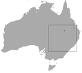 Range map for the Bridled Nail-tail Wallaby


_-_OpenStreetMap_27_December_2025.png)
_-_OpenStreetMap_27_December_2025.png)