Cloudflare fetched the original article and streamed it through HTMLRewriter to apply an entirely new visual system without rebuilding the source page.
// request.cf · coarse context
A page that knows where it met you.
Only coarse request metadata is shown. This demo does not display or persist visitor IP addresses.
The text of the entry was: Did you know ... that a manicule(pictured) in Cicero's Paradoxa Stoicorum had its fingers stretched to cover the full length of a passage?
This article is rated GA-class on Wikipedia's content assessment scale. It is of interest to the following WikiProjects:
This article is within the scope of WikiProject Typography, a collaborative effort to improve the coverage of articles related to Typography on Wikipedia. If you would like to participate, please visit the project page, where you can join the discussion and see a list of open tasks.TypographyWikipedia:WikiProject TypographyTemplate:WikiProject TypographyTypography
This article was copy edited by Littenberg, a member of the Guild of Copy Editors.Guild of Copy EditorsWikipedia:WikiProject Guild of Copy EditorsTemplate:WikiProject Guild of Copy EditorsGuild of Copy Editors
Latest comment: 18 years ago2 comments2 people in discussion
In Mac OS X 10.4.10, running Firefox 2.0.0.7, the "fist" character shows up incorrectly. It's rendered similarly to U+252B, although I'm not sure if that's the actual character being displayed.
I tried to correct the problem by directly entering the proper Unicode character (U+261F), but couldn't figure out how to do so. Could someone else fix this? —Preceding unsigned comment added by 24.21.192.112 (talk • contribs) 23:47, 22 September 2007
I have no idea what the index looks like. My computer can't read it, and shows a little box instead. Is there any way to show the index without resorting to typing it? Savie Kumara07:37, 4 November 2007 (UTC)Reply
Perhaps for this and other similar non-standard character articles, the right-hand summary/navigation pane could feature a graphic of the character, rather than the large-point character itself. Like many, I see only the no-character box.
If there are instructions somewhere in Wikipedia for adjusting your browser to display these characters correctly, a link could be prominently featured. ozNoz23:49, 5 November 2007 (UTC)Reply
Latest comment: 17 years ago1 comment1 person in discussion
The article probably should point out that in the 19th century and before, this was commonly used as a directional indicator in a variety of contexts where we would now generally use abstract arrow shapes (see the pointing sign in the image). Churchh (talk) 22:42, 20 November 2008 (UTC)Reply
Latest comment: 17 years ago1 comment1 person in discussion
The index is (or was, I can't recall) used in Shonen Jump magazine to mark the page numbers, and is used as a rather major detail in Shonen Jump's series "20th Century Boys".
Latest comment: 13 years ago2 comments2 people in discussion
I've also seen a ✌. I don't know whether or not this should be part of the Index article because it's just a fist. I don't know it's Unicode. D:
Colabcalub (talk) 13:14, 28 May 2012 (UTC)Reply
It actually has its own article: V sign. I added a "see also" link from this article. If you happen to come across any other hand-related Unicode symbols, you might try putting them into Wikipedia's internal search engine (or a general-use search engine). That's how I found the V-sign article; we actually have a redirect there from the character. Neat! -- Beland (talk) 17:45, 28 June 2013 (UTC)Reply
Latest comment: 6 years ago1 comment1 person in discussion
This morning, Dbachmann updated the article with this addition:
Signpost with pointing hand in a caricature published in 1773
The now-ubiquitous arrow symbol (→) being easier to draw and recognize, has largely replaced the manicule in many contexts. The arrow symbol appears only in the 18th century, at first in technical diagrams. Its widespread use to indicate directions in signposts etc. does not develop before the early 20th century, and signposts of the 18th and 19th century would sometimes use a pointing hand in place of what would now be an arrow symbol.
I wrote this as an edit note to explain a bunch of citation needed tags, but on further consideration, I think we need a discussion on how best to express this. I wrote
Arrow: credible but a lot of uncited assertions, so tagged as cn. It may be true in hand annotations but in print? What about finger posts? Chevrons on road signs? Index [manicule] is definitely still used, but perhaps decoratively rather than functionally.
Thanks are more due to whoever added that function to {{unichar}}. I failed at the time to understand the issue and this is the first time I've seen it in action. 𝕁𝕄𝔽 (talk) 14:12, 31 October 2025 (UTC)Reply
Go right ahead. Most obviously, the bullet list at #Terminology will be frowned upon, needs to be made into plain text. 𝕁𝕄𝔽 (talk) 11:27, 13 November 2025 (UTC)Reply
Just posting an update: I think it's mostly ready to nominate. I'll probably hold off just a bit to make sure it's not reviewed when time is short for me. If anybody wants to double-check anything feel free. Rjjiii (talk) 07:46, 29 December 2025 (UTC)Reply
It's passed, so I'll also probably do a DYK nomination. @JMF and Colin M: If either of you want to offer a DYK hook (or do the nomination itself) feel free to. Rjjiii (talk) 16:57, 30 March 2026 (UTC)Reply
Have a barnstar for all the work you did to get it to GA. Applause!
We will need to submit a few DYKs. Here are two from me:
Did you know
that the 'pointing hand' style of cursor (used with modern computers) is called a manicule and was invented by medieval monks?
that the 'pointing hand' used on signs (like the one outside the bar in the Cheers TV series) is called a manicule and was invented by medieval monks?
I'm sure that these could be rewritten to be more "catching". Is there an advertising copywriter in the house? 𝕁𝕄𝔽 (talk) 17:32, 30 March 2026 (UTC)Reply
Latest comment: 9 months ago3 comments3 people in discussion
As requested, I am editing for the Guild of Copyeditors. What a great topic!! The writing is quite good, but I do have a few notes:
This paragraph in History seems to be pretty far off the mark and may not be needed very much. Consider deleting:
"The term index had a broader range of meaning in medieval and early Renaissance books.[1] The modern index, an alphabetic listing of topics printed at the back of a book, was not included in medieval manuscript books or the early printed books. Instead, readers would rely on a broad range of indices that they added to their own books, including marginalia, tables, lists, and bookmarks. The term index comes from the index finger which could be used by readers to physically mark one's place when cross-referencing different pages in a book.[2] A common type of marginal index was the nota bene, which translates literally "note well", where a written note would be placed in the margin and often directed to a part of the main text with a manicule."
This paragraph seems to have a number of not-quite-related ideas:
"The oldest book known to contain a manicule is the 1086 land survey, Domesday Book, but the age of the annotation is unknown and may date to much later.[3] Domesday Book uses a range of symbols for marginal annotations including the manicule and daggers.[3] Though the manicule was used for centuries to annotate books by both copyists and readers, there was little written about the mark itself. Printer John Johnson's 1824 guide and history of typography, Typographia, Or The Printers' Instructor, lays out the book's various reference marks, such as the dagger, manicule, and asterisk as reference symbols that "in most instances explain themselves."[4]"
Is the paragraph about the Domesday Book or the lack of discussion about the manicule? is Johnson referring to Domesday or books in general? Do his comments help the reader understand the manicule at all?
The picture of Gill's manicules is great! Can it be cropped to eliminate the other characters?
This section in Print is very erudite, but not really about manicules. Consider deleting it.
The earliest Greek documents were written in solid blocks of capital letters without spaces, paragraph breaks, or punctuation. Literature scholars believe these manuscripts were meant to be read aloud. The paragraphos was introduced by scribes in the 4th century AD as a line placed beside a block of text. These marginal symbols evolved into a pair of abbreviations. A stylized , for kaput or 'head', was placed at the beginning of new sections; a , for capitulum or 'little head', which evolved into the pilcrow () was placed at the beginning of subsections that modern readers would recognize as paragraphs. Spaces were left at the beginning of paragraphs in many early print documents for rubricators to hand-draw the pilcrows. These spaces were eventually left unrubricated leading to the modern tradition of indenting a paragraph.
Overall, this is a fine article that was a pleasure to read. Thanks for creating it!
Although I'm not one of the main contributors, these look like useful remarks to me and I will have a look in detail tomorrow (UTC+00). Thank you for doing the copyedit: although I quibbled with two or three of your changes, in the main they were useful improvements. --𝕁𝕄𝔽 (talk) 20:33, 15 December 2025 (UTC)Reply
Thank you, both! Some things probably were out of scope or off-topic. I've moved the the discussion about marginalia in general to Marginalia#History. I've also tried to clarify the Domesday Book paragraph. The paragraph on the Renaissance index is directly related to the etymology and function of the manicule. I'll think over if maybe there is a better way to make that point clear. Rjjiii (talk) 14:47, 23 December 2025 (UTC)Reply
I have User:Trappist the monk/HarvErrors.js installed and strongly recommend it. It identifies a variety of errors and omissions. Harv references (especially {{sfnp}}) are well worth while, make the source much more readable and the output looks more professional (than regular <ref> ... </ref> tags. (I don't understand why anyone would want to use {{harv}}inside<ref> ... </ref> tags, unless it is a habit predates sfnp). 𝕁𝕄𝔽 (talk) 10:43, 16 December 2025 (UTC)Reply
You seem to have cleared them up anyway. The only ones left for me to resolve were the Unicode standards. (I also suspended two more unused sources.) 𝕁𝕄𝔽 (talk) 12:42, 16 December 2025 (UTC)Reply
Latest comment: 9 months ago4 comments2 people in discussion
In the table at Manicule#Emoji, what is the line "default appearance" intended to convey? Is it the representative glyph in the standard? (because 'text' is not the default [i.e., no VS applied] on Android nor ChromeOS for U+261D☝WHITE UP POINTING INDEX). But do we even need this line? what is its purpose? 𝕁𝕄𝔽 (talk) 13:08, 29 December 2025 (UTC)Reply
"default presentation"? Maybe we don't need that row in the table at all. When it was added a couple years ago, there was less prose context in the Unicode section. Also, you're right about Android and ChromeOS which are both very common. "default appearance" was originally worded as "base code point" which seems too technical for a general audience. Rjjiii (talk) 15:42, 29 December 2025 (UTC)Reply
The following discussion is closed. Please do not modify it. Subsequent comments should be made on the appropriate discussion page. No further edits should be made to this discussion.
Hello, I'll take on this review. I once used the Cincinnati Type Foundry manicule in some vintage-style chalkboard art and have had a soft spot for it since. The article looks to be in great shape after an initial read-through; I should have some (minor) prose comments for you by later today or tomorrow. DrOrinScrivello (talk) 18:09, 24 March 2026 (UTC)Reply
Most of these comments are fairly minor. I'll try to indicate when they are merely suggestions and not necessary to pass the review. I've already made a few small and hopefully uncontroversial copyedits, but feel free to revert anything you disagree with.
Overall, the lead looks good. It's possible I'll have some comments on breadth after the rest of the review, but I doubt it.
The manicule, derived from the Latin manicula, or 'little hand', has been known by many other names, I think you should either adjust the wording here ("The term manicule was derived from the Latin manicula, or 'little hand', though it has been known by many other names") or put the derived from the Latin manicula, or 'little hand' bit inside a parenthetical, which would make it more initially clear it's the terminology being discussed.
With the bit that begins with Sherman writes that three are likely conflations with other terms, I recommend a structure similar to, "The first of these, the pilcrow..." then "The second, the maniple..." and "The third, indicule,...". Just a personal preference, but I think it would make it read clearer.
While the pages on a scroll are written on the same long length of papyrus or parchment, Are they still considered "pages" when in a scroll format? Maybe "While the text on a scroll is written..."?
I think the columns of text running perpendicular to the flow of a scroll are still pages, but I've used your suggested wording to avoid confusion. Rjjiii (talk) 11:55, 28 March 2026 (UTC)Reply
Stallybrass argues that the codex encouraged discontinuous reading of a text I'm of the opinion that the emphasis is unnecessary here, but if you decide to keep it, the MOS recommends using {{em}} for accessibility.
and using the same Gothic rotunda font This seems like a bit of an WP:EGG link to me. My first thought was to link it to Rotunda (script), but that's not the same as the typeface you're describing. I'm open to other arguments, but I'd say lose the link.
Some gravestones included manicules pointing upwards, towards "the hope of heaven" I think this quote should be attributed somehow. EDIT: See the source review below before putting too much time into this. DrOrinScrivello (talk) 16:23, 26 March 2026 (UTC)Reply
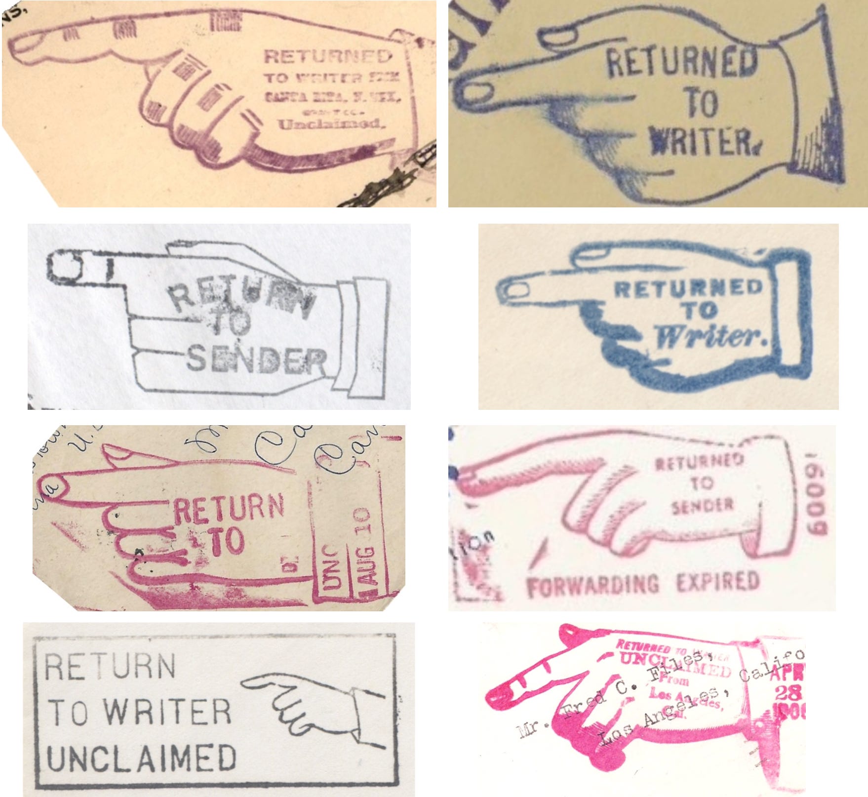
a graphical indicator meaning "Return to Sender"I don't think the phrase needs to be capitalized.EDIT: While I can't access the source cited at the claim, in doing my spot check I've just seen that the Saturday Evening Post used the same capitalization, so I'll retract this comment. DrOrinScrivello (talk) 16:09, 26 March 2026 (UTC)Reply
It's also on page 13 here: "Hasler was particularly interested in their use in commercial and industrial settings, and they come to play a crucial role in the visual vocabulary of advertising—as well as in public signage (most obviously in “fingerposts”), and in a wide range of official documents (including the “Return to Sender” stamp used by the US Postal Service)." The actual stamps capitalize every letter, so I'm not sure why the sources captialize just two. I've copied the formatting used by the source, but if there is a MOS issue, I don't think it affects verifiability to change the capitalization. Rjjiii (talk) 11:44, 28 March 2026 (UTC)Reply
Even in the first few centuries of use, it was used to draw attention to specific text, In my opinion, the use of "even" here suggests that this is a surprising fact, when I don't necessarily think it is. Suggest re-wording to "From its first few centuries of use..." or "Since the beginning of its usage..." (or something similar that's supported by the sources), but I won't argue if you disagree.
and manicules to indicate terms that can be cross-referenced, or looked up under another entry. Cross-referencing is mentioned in the previous paragraph. Suggest moving the link and short definition there.
I think that's it for prose. Like I said, pretty much just nit-picky stuff; it's a well-written article. I'll probably begin the source review tomorrow at some point. @Rjjiii: throwing you a ping since I haven't yet, but don't feel the need to rush. DrOrinScrivello (talk) 22:23, 25 March 2026 (UTC)Reply
Thanks for the feedback. I'll start going through it. Let me know if you need quotes from or copies of any of the sources. Rjjiii (talk) 01:39, 26 March 2026 (UTC)Reply
Sounds good, thanks. I actually got Houston 2013 from my library (looking forward to reading the rest of it), and between that and online sources I should be able to do a satisfactory spot check, but I'll let you know if that changes. DrOrinScrivello (talk) 14:35, 26 March 2026 (UTC)Reply
Sourcing in general looks good, with the possible exception of I Love Typography, which appears to be a blog. Do you know if the author is a subject matter expert?
@DrOrinScrivello: I'm citing Boardley as a subject matter expert there. That blog post mentions and is related to his 2019 book Typographic Firsts, published by Bodleian Library, University of Oxford. Rjjiii (talk) 11:45, 28 March 2026 (UTC)Reply
I'm going to spot check ref #s 2, 6, 11, 14, 26, 32, 35, 47, 55, and 61 as of this revision.
2. Y
6. Y
11. Y
14. (a) Y (b) Y (c) Y
26. Y
32. (a) ? This claim is supported by the cited source, but in looking at this in conjunction with my comment upthread about attributing the quote, I decided to look at who is actually being quoted. The cited source says By some accounts, the upward-pointing version represents "the hope of heaven," whereas the downward-pointing version represents "God reaching down for the soul" and is associated with untimely death (Powell, 2018). Their "some accounts" seems to just be Powell 2018, a ThoughtCo article/listicle that makes a lot of claims about gravestone symbolism but doesn't cite any sources itself, and ThoughtCo is yellow on WP:RSP. Do you think there's any chance of finding another source for this claim? (b) Y
Update: I've been reading through Shady Characters, and on page 183 he writes, Manicules even appeared on nineteenth-century gravestones, pointing "electrically heavenward," as Paul McPharlin put it, so that may work as a substitute should you want to use it. DrOrinScrivello (talk) 15:24, 27 March 2026 (UTC)Reply
Ah, you're right, and since the Wikipedia article already cites Paul McPharlin's work, I've revised that section to cite McPharlin and to be more specific. Rjjiii (talk) 11:47, 28 March 2026 (UTC)Reply
@DrOrinScrivello, thanks for all of the feedback! I've replied to some specific points above. If you disagree on I Love Typography, I'll trim that section down. For "Return to Sender", I just used the formatting from the source, but I can change it if the Manual of Style prohibits the formatting. Rjjiii (talk) 18:50, 29 March 2026 (UTC)Reply
All of the above changes look good, thanks for being open to my suggestions. I'm satisfied with your argument regarding Boardley as a subject matter expert. Image review, breadth, and miscellaneous criteria review to follow shortly. DrOrinScrivello (talk) 13:15, 30 March 2026 (UTC)Reply
The article is well illustrated, well captioned, and properly licensed. I think this is my first GA review where the images already had alt text, which while not a requirement I always recommend, so thank you for that.
The article is stable and written from a neutral perspective. The only things flagged by Earwig were quotes, and no other copyright concerns were detected during my spot check.
Having now read through a number of the article's sources, I believe the article to be a thorough examination of its subject without going into excessive detail or omitting any significant coverage. The article's talk page demonstrates previous efforts at honing the focus which I think were largely successful.
The discussion above is closed. Please do not modify it. Subsequent comments should be made on the appropriate discussion page. No further edits should be made to this discussion.
... that a manicule(pictured) in Cicero's Paradoxa Stoicorum had its fingers broken to cover the full length of a passage?
Source: Sherman, William (2005). "Toward a History of the Manicule"(PDF). Centre for Editing Lives and Letters, University College London. pp.11–12. A 14th-century Cicero at Berkeley has been heavily annotated by a reader using a fanciful hand in which the rubbery fingers stretch out to bracket and sub-divide a long and crucial passage. The text inscribed on the unusually capacious cuff indicates the nature of the reader's interest.
ALT1: ... that the 'pointing hand' used on signs (like the one outside the bar from the Cheers TV series) is called a manicule and was invented for medieval manuscripts? Source: Ross, Morgan Allison (19 November 2025). "Bostonians React To Odd Hand On Cheers Sign". Comic Sands. Retrieved 2026-04-04. Fun fact: the pointing-hand motif is actually a real 19th-century trade-sign style used outside taverns and shops. So the limp digit might be an attempt at "colonial authenticity." Unfortunately, it landed closer to "the sign needs a prescription from Dr. Frasier Crane." And for newcomers who don't have time to text the parentals with a "wait, what's Cheers?": the comedy sitcom premiered in 1982 and was nearly canceled after ranking dead last among 77 network shows. So yes, the limp thumb still performed better than the pilot.
ALT2: ... that the 'pointing hand' style of cursor (used with modern computers) is called a manicule and was invented for medieval manuscripts? Source: Sherman, William (2005). "Toward a History of the Manicule"(PDF). Centre for Editing Lives and Letters, University College London. p.13: With the advent of personal computing, and particularly the development of the internet, manicules would be put back in readers' hands: as companies like Microsoft tell us, big gloved hands are not powerful weapons of the authorities but rather powerful tools for the people, the means by which (as a famous series of ads promised) we can travel anywhere we can point our finger. "Digital" technically refers to the use of discrete numbers, which were originally reckoned on the fingers, or digits; but the developers of operating systems and interfaces have had the hand's indexical functions in mind from the start.34 In 1980, Allen Kay developed SmallTalk, the first commercial object-oriented programming language and probably the first to use a hand-shaped cursor, for the Xerox Star, the immediate forerunner to Apple's Lisa, which would evolve into the Macinstosh.
ALT3: ... that print encyclopedias have used the ☞manicule to cross-reference articles? Source: Robert McHenry. "The art of the cross-reference". Fortnightly Review. Properly used, q.v. is a strong signal that what is being pointed to is germane and substantive. Hence the mildly imperative tone. Somewhat less peremptory is see also, with its implied "if you wish; if you have time; could be interesting." Some texts go a step farther and provide cross-references that exist only for the sake of a kind of obsessive completism, with no promise of any utility. Thus, for example, those encyclopedias that mark, often by the ideogram ☞, any term in the text that is also an entry title in its own right. This is roughly equivalent to "oh, and we also have…."
I like the first one, with the image. The hook's source checks out and seems reliable. Article has recently passed GA (good job!). No evidence of copyvio, the QPQ checks out, and the article is generally pretty good. No complaints from me here. Generalissima (talk) (it/she) 01:52, 7 April 2026 (UTC)Reply
Latest comment: 5 months ago5 comments2 people in discussion
Quote from the lede: The manicule is infrequently used today, except as an occasional archaic novelty (added in Special:Diff/1062039126, 25 December 2021).
I don't find this referenced again in the article, and this lacks a supporting citation. At the time when this was added to the article, it did have a reference, Houston (2013), but no page number was given and the citation has since been removed. I am tagging Colin M, who originally added this; and Rjjiii, who has been working on the article more recently. As far as I can tell, this was not brought up during the GAR last month.
I think the modern usage is important to discuss, and I find the usage as an archaic novelty interesting. I'd be happy if this could be kept and expanded upon, but not if there's nothing to say about this beyond the lede section (and of course not without a citation). Renerpho (talk) 01:19, 30 April 2026 (UTC)Reply
@Renerpho: Quote from the first page of chapter 9 in Houston (2013): "Weathering the transition to hot metal type with barely a break in its stride, manicules continued to grace the margins of book for hundreds of years afterward. Yet like so many other marks of punctuation, the arrival of printing heralded its ultimate downfall, and today it is regarded as a typographic novelty to be trotted out for pieces requiring a certain period flavor. In his 2005 essay “Towards a History of the Manicule”—the publication of which earned him the mantle of the manicule’s sole historian—Professor William H. Sherman of York University noted that “between at least the twelfth and eighteenth centuries, [the manicule] may have been the most common symbol produced both for and by readers in the margins of manuscripts and printed books.”1 Only two centuries later the manicule is almost nowhere to be seen: its fall has been precipitous indeed." Rjjiii (talk) 01:26, 30 April 2026 (UTC)Reply
@Rjjiii: Thanks! I just noticed that this did have a section/page number when it was removed in Special:Diff/1323372454, agreeing with the section you're quoting.:) I suggest to add the reference back, or -- better -- to actually write something about this in the article that would justify talking about this in the lede. Renerpho (talk) 01:29, 30 April 2026 (UTC)Reply
Thanks; I've restored the inline citation to Houston's chapter on the manicule to the lead section. Here is the final paragraph in the "In print" section: "Its popularity declined toward the end of the nineteenth century, perhaps due to oversaturation in advertising. By the 1890s, it was used more often for ironic effect. Sherman (2005) argues that as the symbols became standardised, they were no longer reflective of individuality in comparison to other writing, and this explains their diminished popularity. As they were replaced by simpler arrows, the pointing hand became associated with the past and is sometimes used as part of an old-fashioned or "vintage" aesthetic. The manicule became obscure enough that it was omitted from many typefaces, being left to specialist faces containing dingbat characters. More recently, OpenType computer fonts have begun to include custom manicules in their repertoire." I'm open to suggestions on additional aspect to cover to here, but may not have time to write until tomorrow evening. Rjjiii (talk) 01:40, 30 April 2026 (UTC)Reply


 Done 𝕁𝕄𝔽 (talk) 17:37, 29 December 2025 (UTC)
 This claim is supported by the cited source, but in looking at this in conjunction with my comment upthread about attributing the quote, I decided to look at who is actually being quoted. The cited source says By some accounts, the upward-pointing version represents "the hope of heaven," whereas the downward-pointing version represents "God reaching down for the soul" and is associated with untimely death (Powell, 2018). Their "some accounts" seems to just be Powell 2018, a ThoughtCo article/listicle that makes a lot of claims about gravestone symbolism but doesn't cite any sources itself, and ThoughtCo is yellow on WP:RSP. Do you think there's any chance of finding another source for this claim? (b)
  ·
·  ·
· 

 I like the first one, with the image. The hook's source checks out and seems reliable. Article has recently passed GA (good job!). No evidence of copyvio, the QPQ checks out, and the article is generally pretty good. No complaints from me here. Generalissima (talk) (it/she) 01:52, 7 April 2026 (UTC)