


File talk:2000 Year Temperature Comparison.png
Add topic | This file does not require a rating on Wikipedia's content assessment scale. It is of interest to the following WikiProjects: | |||||||
| ||||||||


Legend
[edit]
Where is the legend to this chart? The lines are not described and therefore they mean nothing really. There is no information what the red, yellow, blue, green and so on line means and it gives reader nothing but feeling of confusion. How one can guess what are these lines when they are not named? If you'll give me source of these data I will do it properly and professionally. 88.108.234.195 (talk) 20:16, 15 October 2016 (UTC)

Error margins
[edit]
I remember this graph with error margins for the past of the same magnitude as the hockey stick in the end —Preceding unsigned comment added by 87.162.210.217 (talk) 21:03, 5 August 2008 (UTC)

Briffa truncation
[edit]
There is an undocumented omission in IPCC graphs of post-1960 values for Briffa MXD, which would appear as a precipitious drop to the 1980s.
- See Talk:Temperature_record_of_the_past_1000_years. I don't know whether or not it was "undocumented" by the IPCC or not, but Briffa and colleagues had been advocating dropping the post 1960 section since at least 1998, well before the 2001 IPCC report was written, so it is really Briffa's issue, not the IPCC's. On the figure I generated, the curve attributed to Briffa appears in the form which Briffa published it. Dragons flight 00:03, May 10, 2005 (UTC)
- Yes, I am aware of some of the uncertainties in dendroclimatology. But why are you truncating? (SEWilco 05:22, 10 May 2005 (UTC))

- Cause Briffa told me to? Briffa 2001 only provided data till 1960, so I can't very well invent the extra data points to extend the record beyond what he tells people to use. Nor would I consider it useful, for the purposes of this plot, to try to reconstruct those values (for example by going back to his earlier work). This plot is meant as a comparison of temperature reconstructions, so in this plot it doesn't make sense to include data which everyone agrees is unrelated to temperature. If the point of the plot were to show how screwed up tree ring data can be, then I would have no objection to including it (if I had it), but that would be a different plot, probably one comparing tree ring series over just the instrumental period and be less smoothed, for example. Dragons flight 06:17, May 10, 2005 (UTC)
Appreciation
[edit]
This is great work: both in research and in editing. This is what an image page should be. Kudos — Clarknova 05:19, 1 December 2005 (UTC) Especially the editing (the thick black line in particular!) One of the finest examples of Climate Science. — Jos.Bergervoet (talk) 17:44, 23 July 2014 (UTC)

Criticism
[edit]
Why not take the COLDEST year from 1900 to 2010 and Hockey Stick the thick black line based on that? Would be just as accurate as this chart which chooses to pick one of the warmest years. While they are it, why don't they take a reading from the Mojave desert in July 2009 and just HOCKEY STICK the whole graph up based on that? It would look much more dramatic and be equally irrelevant and misleading. —Preceding unsigned comment added by Afenic (talk • contribs) 04:16, 7 December 2009 (UTC)

2000 years of data smoothed at century type intervals and then throw in ONE DATA POINT, 2004, and Hockey Stick the whole graph up with a thick black line? This is disgusting psuedo-science. Why hasn't this chart been removed? —Preceding unsigned comment added by Afenic (talk • contribs) 04:06, 7 December 2009 (UTC)

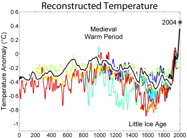
This is a very attractive diagram - with an excellent summary. But.... Why is there so much variation between the different samples? The temperature anomaly cannot simultaneously have been (as shown around about 1370) -0.8 deg C and -.2 deg C. The spread of values is wider than the modern increase. And why does the modern data series leave all of the others behind? If they are assumed to correctly predict past temperatures, shouldn't they reflect modern temperatures? Sorry to nitpick - but my main point is - can you include error bars - if you get a chance to do this kind of good work again? (and if they exist!) I saw the graph of the last 150 years and so I don't want to put you off - it's great information. --Dilaudid 21:20, 4 December 2006 (UTC)

- Variation. Fair point - but a difficult one. Sometimes they measure different things. Or different methods of reconstruction. There is (ahem) some slight controvery over this issue. And why does the modern data series leave all of the others behind? - for the obvious reason: its got warmer. Error bars: I don't think they all come with error bars. Some individual series do - MBH for example William M. Connolley 22:56, 4 December 2006 (UTC)

- The black line represents instrumental data and putting it together with reconstructed data is just dishonest. The two are apples and oranges. Yet the way the graph is constructed it leads the reader to believe the black line somehow updates the reconstructed data. Kauffner (talk) 09:25, 8 July 2010 (UTC)

- I would presume that not all these samples came from the same geographic location, and that there was some level of local variation in temperature. This could account for the discrepancies between samples. --Saforrest 04:48, 2 November 2007 (UTC)

- Not all of the methods are capable of predicting temperatures. As an example, tree-ring data is obviously not available before the tree has grown. Also, it is worth noting that the uncertainties are smaller for more recent data ( since ways to measure it has improved ). 85.224.77.212 (talk) 18:58, 14 December 2007 (UTC)

The black line is hiding the colored lines showing lower temperatures. A skeptic would say it is intentional. -- RossenV (talk) 11:04, 10 December 2009 (UTC)

The graph displays 11 plots, six of which are directly from CRU and a few of the other five are also based on CRU data. This gives the false impression of consensus. Additionally "Mike's Nature trick" appears to be employed in most of the plots, making them unsuitable for this kind of work. Due to these flaws, I request the image to be updated or deleted. Tronic2 (talk) 11:19, 22 December 2009 (UTC)

Apart from all else this graph is now grossly out of date. Its now 2010, how long do we have to wait for an update seeing as new data is in? It is astounding that such a misleading and out of date graph can remain present in a feature article. —Preceding unsigned comment added by 220.244.42.169 (talk) 13:24, 30 January 2010 (UTC)

I really find this disturbing, to see Wikipedia now firmly in the grips of this recent wave of pop-science dressing itself in the clothing of actual, impartial scientific study and observation. Overlaying this graph of data derived from tree ring samples and other deciduous detection mechanisms with actual surface temperature data collected from extremely limited to singular data-sets is fundamentally flawed. Furthermore, this "data" is further suspect because of sampling within proximity of urban heat islands. Global mean temperatures were highest during this current interglacial period during the heyday of the Roman empire, approximately 1.5 degrees Celsius higher than the current global mean, during what has been described as the Golden Age of Rome. This is atypical of ice age interglacial periods, keeping in mind that we are very much still in an ice age, merely an interglacial period of one, a period which will eventually end with a sharp and profound drop in global temperatures and re-expansion of global ice sheets (the phenomena most associate with and mistakenly refer to as "the ice age"). Daystrom (talk)
- Just for fun... you might want to read urban heat island. Meanwhile: you're *sure* that current temperature records are unreliable, but you're also *certain* that Global mean temperatures were highest during this current interglacial period during the heyday of the Roman empire - based on, what? The extensive records of the time? Perhaps you'd care to tell us: what was the temperature of, say, Australia during this period? This is a common skeptic misunderstanding William M. Connolley (talk) 07:46, 29 April 2010 (UTC)

Zero
[edit]
What is the zero set at for this chart? Rmhermen 21:19, 10 February 2006 (UTC)

- The instrumental data (which is what all the other records are keyed to) is anomalies from 1950-80 - see . William M. Connolley 22:00, 10 February 2006 (UTC)

- It's relative to an average of temperatures over thirty years - based on the assumption that temperatures are mean reverting over the medium-long term (i.e. excluding ice ages) any variation of temperature from this mean could be considered an "anomaly". Sorry for the answer that is probably more basic than you needed - but I didn't understand what a "temperature anomaly" was at first. --Dilaudid 21:25, 4 December 2006 (UTC)
- It is apparent that the average temperature of all of the data points in not the average of what is displayed. Since most of this data is a swag, the zero point should be the average of all of the models. Cvairin 18:36, 5 February 2007 (UTC)


Another version without the black line?
[edit]
| No change |
|---|
| The following discussion has been closed. Please do not modify it. |
|
Would it be possible to create another version of this image that does not include the black line? Its spike at the end is likely what catches many people's attention, but given that the length of that series only makes up a small portion of the 2000 years, it doesn't really provide much in the way of temperature comparison over the 2000 years. You can note also that that line is thicker than the other lines, that it is the darkest in color, and that it is on top of all the other lines; all of which draw extra attention to it, when it should arguably have the least attention paid to it since it is the shortest series and we do not know what would have happened with it before 1856 (and particularly during the medieval warm period). Many people would find all of this to be evidence that the creator of this image is being intentionally deceptive. Come on folks. It's really hard to convince people of the need to be concerned about global warming when evidence for it can come across as being purposely misleading. That makes the whole movement of global warming concern lose credibility, and no wonder so many people doubt global warming's existence. I'm not telling anyone here not to use this image, but I would like another image to use that cannot be so easily labeled as being intentionally deceptive because people will believe that image more and that image will not cause the sort of harm to the movement's credibility that this image does. So, if possible could a version without the black line be made? Thanks, HalfDome 02:54, 10 May 2006 (UTC)
In my opinion, the most interesting feature of the history of climate is how it relates to recent changes. The black line provides the context between past changes and the present day, and of all the data presented in the plot it is almost certainly the most well established. If you think it is deceptive to emphasize the most accurate data, then I don't know what to tell you. Also, I would note that most of the long-term reconstructions stop at or before 1980, and none continue past 1995, so I don't know how you would plausibly discuss the significance of recent warming without comparing it to an instrumental record. Dragons flight 23:16, 21 May 2006 (UTC)
Here is the average of the same data without the misleading plot points. http://www.geocraft.com/WVFossils/PageMill_Images/image158.gif
How you can simply tack on recent measurement to a long term graph and call that acurate seems kind of absurd. How do you know the scale is the same perhaps the black line needs to be moved up or down by 10 degrees for all you know! Moreover the entire article on global warming is then pretty much based on the idea that that black line is correct and the rest of that graph showing longer history is not discussed. I mean really people accuse the "skeptics" on this issue of being unscientific but when you start your measurement you calibrate your intstrument first. The idea of simply adding data sets from totally different measuring tools really isnt proper. Maybe if you were going to average them or compare the results, but to use a totally different tool to extrapolate a graph beyond its data points?! - Anon
I don't mean to state the obvious here, but has any of you slapped a rule on this little graph... looks to me like we were in a pretty steady warm up from 0 to 1000 and then had that little cool down and now are back on track... line from 0 thru 1000 to 2004 is pretty consistent - the anomoly looks like the period taht everyone keeps telling us to use as the benchmark (1960-190 or so)... Is it just me or are some people declaring a 'warming period' based on a comparison to an 'anomolous cooling period'... Of course I'm just looking at it at a glance which seems to be how it was intended to be viewed since much of the most recent detailed data appears to be blotted out by that lovely black line there at the end... Oh- and I agree - why don't we just chart temperatures? What's with the base line of a 30 year average - what do people have against real numbers - why must everything be compared to an average instead of actual real life data? KJ 17:46, 16 April 2007 (UTC) I'm reading over this discussion and wondering, if we are truely coming out of a LIA then shouldn't higher temps (averaged or real) be expected to be higher? And if so, why all the terror talk? Why is it bad for temps to be warmer than in the previous recorded times if we are coming out of a LIA? Shouldn't this be considered a normal effect of coming out of a cooling pattern? Also, correct me if I'm wrong but the industrial revolution started around 1900. The warming trend (I think from what I've been reading) started about 100 years before that. Therefore, human industrial activity would be more a byproduct of warmer tempertures allowing societal change, not societal change creating warmer temps. 76.1.89.5 07:29, 8 July 2007 (UTC)Sherry
So are you saying that since the industrial revolution began in the 18th century that the total output of that period created the warming in the chart? Now - I want to emphasize here that you are saying the amount then produced the shift then - which would mean that extrapolated out to current production the earth should pretty much have turned into a smoldering ball of molten lava by now... basically you would be saying that the second the first bit of industrialization occured the earth experienced a major shift in temperature as you would be saying it took exactly zero time to build up and begin the process of global warming... do you truly believe that the first time someone burned a 2" lump of coal the earth warmed? I have a hard time with that - if you can give a logical relationship I'm open, but to say that "The nasty human lit a single match and the global temperature rose" is pushing it a bit. I guess I'm just having a problem believing that the planet survived all this time and then 'one day' it just couldn't take it anymore... explain to me how the amount of production back then so rapidly produced the effect and then explain how the increase we've seen in production hasn't increased the effect at least as quickly - because, I'm sorry, but again I come back to running the numbers and we all should have been incinerated decades ago if that were true. —Preceding unsigned comment added by Kjpino (talk • contribs) 05:00, 22 March 2008 (UTC)
Have to agree with HalfDome on this one. My eye was immediately drawn to the black line, and my initial assumption was that all the data had such a strong upswing at the right. Only after carefully looking at it did I notice the other, lighter colored lines closer to the x-axis. There's no need to politicize raw data. The very fact that this is even being discussed shows that it has become more than just the numbers.Barryap (talk) 23:07, 20 July 2009 (UTC) |


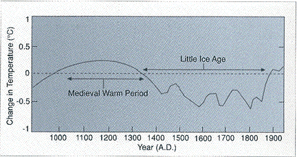


What's with CRU's black line and asterix? it's the most prominent line but it only depicts an upward trend ( and covers the shortest period ).. I smell bias here. -Ben From Ottawa Canada —Preceding unsigned comment added by 70.48.40.135 (talk) 03:39, 23 December 2009 (UTC)

Why not measure actual temperature?
[edit]
What would be much more interesting is to display a graph showing the change in actual temperature over this period, rather than the "temperature anomaly."
- Why would it be? If you like, just shift the entire plot by X, where X is the global mean temperature. About 13 oC from memory, but its not as well known as the anomalies. William M. Connolley 13:45, 10 July 2006 (UTC)

- A graph showing temperature instead of variation, especially one starting from zero degrees, would be practically a flat straight line. You have to magnify the graph to 1/10 of a degree to see the variations. A better question might be why isnt there a graph including the long term temp variations over millions of years which is many degrees of varation as opposed to the 1/2 of a degree in recent measurements.
- There's no particular reason the y-axis of the graph has to start at 0. It could start at the global mean temperature minus 1, for example, and look identical to this graph but with different numbers on the side. --Saforrest 04:52, 2 November 2007 (UTC)

- It is sad that these graphs always show anomaly around some arbitrarily chosen point, making cross comparison of different diagrams impossible. It would be more scientific to use the actual temperatures on the Y scale. Tronic2 (talk) 11:10, 22 December 2009 (UTC)

- Well, tell us how to measure the "actual temperature". One can fairly simply define an anomaly (the change from some common period) for any location and then compare anomalies or find averages of them. This provides a useful way of comparing temperature changes in say Miami and Toronto and finding the average of the changes, but the average absoltue temperature of Miami plus Toronto doesn't help you much. The same pretty much goes for averaging temporally over a year. You can look at the change of temperature from one year to the next in the same season. So anomaly is a fancy word for change. Joshua Halpern —Preceding unsigned comment added by Jhalpern (talk • contribs) 01:33, 23 December 2009 (UTC)

Expired: Is this image obsolete?
[edit]
It seems to me that this image needs to be updated. 9 of the 10 reconstructions lack data from the last 15 years. With the exception of the black line (the shortest set, covering only 13% of the span), only one set has data up to 1995. Yet the graph terminates at 2000, giving the false impression that the data is somehow even 7 years recent, and there is one lone single-value plot for 2004 that is represented with a prominent asterisk and label. --Magoon (talk) 16:34, 20 December 2007 (UTC)

- Do we have the source data for this image? After reading the archived "no change" section and this whole talk I still don't know what data sets the individual colors come from. I know that people are strongly defending the image so it would be nice to be able to recreate the original and just update it with more recent data. Cubbieco (talk) 21:15, 21 December 2009 (UTC)

- I'm puzzled. There is a list of papers, one for each colour. Is there a colour that you don't know which paper it comes from? As for the update, see divergence problem. Only the instrumental data gets updated William M. Connolley (talk) 23:07, 21 December 2009 (UTC)

- LOL The the thick black line IS hiding the decline! The divergence is concealed, the instrumental line should be grey and behind all reconstructions. The highlighted 2004 value is useless as all spaghettis in the graph are smoothed values. NB I won't be editing the graph, as I know my edits wouldn't survive 10 minutes. Hans Erren (talk) 13:41, 24 December 2009 (UTC)

MWP North-atlantic only or global?
[edit]
In the article Temperature record, this graph is descibed as:
- Comparison of many reconstructed proxy temperature studies covering last 2000 years
in the article Medieval Warm Period, it is described as:
- Northern Hemisphere temperature reconstructions for the past 2000 years.
The first implies a global temperature record, the second implies that the MWP was North-Atlantic constrained. Which is correct? Which one should be changed? --naught101 (talk) 09:09, 14 December 2008 (UTC)

The graph apparently contains mostly tree ring reconstructions from the Northern hemisphere, but mixes the data with global mean temperatures for recent years. Some of the proxy datasets used appear to model global temperatures (based on the abstracts of the relevant works). Tronic2 (talk) 11:35, 22 December 2009 (UTC)


http://www.ncdc.noaa.gov/paleo/pubs/pcn/pcn.html might be useful William M. Connolley (talk) 23:19, 22 December 2009 (UTC)

Plot using Google's Chart API
[edit]
Has anyone thought of using the Google Chart API (that page needs work) to produce the plot? It tends to produce very appealing graphs, not to mention being editable on-the-fly. If I understand correctly, the data is publicly available. Just throwing the idea out there. --Alibubba7 (talk) 01:41, 23 December 2009 (UTC)

Remind people this is not factual data.
[edit]
This is reconstructed by climate models and is not actual fact. This needs to be stated somewhere.--92.28.135.31 (talk) 18:45, 7 January 2010 (UTC)

- No it isn't William M. Connolley (talk) 20:10, 7 January 2010 (UTC)

This graph is indeed not based in fact. —Preceding unsigned comment added by 216.40.69.149 (talk) 22:01, 28 December 2010 (UTC)

Updated data
[edit]
Why isn't there an updated plot which includes 2009 as the final data point? —Preceding unsigned comment added by Mjspe1 (talk • contribs) 04:41, 4 March 2010 (UTC)

The thick black line
[edit]
Why is the black line thicker than the other lines? (I copied the image and pasted it in Paint without stretching or compressing it, and the black line as at least 1 pixel thicker than the others) It is hiding where the other lines are and where they end. Why is it even black when the others are coloured? Shouldn't it be something that is more like the other coloured graphs, like pink, maybe? Can we have it thinner and in a different colour, please? --Joshua Issac (talk) 16:39, 9 April 2010 (UTC)

- This is Wiki's version Mike Mann's famous "hide the decline" trick. The graph is labeled "Reconstructed temperature", yet the line colors and thickness cause the reader to focus on the instrumental data. If the idea is to compare the instrumental and reconstructed temperatures records, then time period should be the same. Reconstructed temperature records do not normally show a massive upswing in recent years, which is what a casual reader would think looking at this graph. What's up with the asterisk for 2004? There is no other single year value on the graph. Everything else is smoothed. It encourages the reader to mentally connect the asterisk to the black instrumental line, which is totally invalid. Kauffner (talk) 08:25, 1 June 2010 (UTC)

Loehle, 2009
[edit]
Is there any way that the reconstruction from "Correction to: A 2000-YEAR GLOBAL TEMPERATURE RECONSTRUCTION BASED ON NON-TREE RING PROXIES" by Craig Loehle could be added to the graphic?
http://farm3.static.flickr.com/2666/3914214320_261cba1cf2_o.png —Preceding unsigned comment added by Nursebhayes (talk • contribs) 16:03, 28 May 2010 (UTC)

- With a proper source, it might be possible (though the Loehle paper has been heavily criticised). But why would you bother? It has basically the same as before, except it is truncated so doesn't show the recent warmth William M. Connolley (talk) 16:20, 28 May 2010 (UTC)

Any reason this page is still referring to graph 10 years out of date? Why no data from 2004-2013? 71.74.135.29 (talk) 14:06, 9 August 2013 (UTC)

- The most likely reason is the main focus of this graph is to cover an event that happened hundreds of years ago, so I don't see what covering the last decade will achieve in this situation.--174.93.163.194 (talk) 04:01, 3 December 2013 (UTC)
- Ops I thought that this was about its inclusion in the medieval warm period page specifically.--174.93.163.194 (talk) 04:04, 3 December 2013 (UTC)
- The most likely reason is the main focus of this graph is to cover an event that happened hundreds of years ago, so I don't see what covering the last decade will achieve in this situation.--174.93.163.194 (talk) 04:01, 3 December 2013 (UTC)


General Issues
[edit]
This image is marked as having "little importance", and is the subject of some reasonable criticism. Yet it prominently appears as the primary, otherwise unquestioned representation of global temperature by Wikipedia. And by the uninitiated, it may be inferred as the prominent modern view of the internet and/or world at large. It appears on over 150 pages, in over 50 languages.
This is problematic for the following reasons, completely aside from the controversial "hockey stick" portion from the late 1900s.
The graph excludes error and uncertainty ranges, and disregards the credibility (or lack thereof) of the underlying data sources (by their inclusion, each is given equal authority). The image itself has no legend, description, or caveats. Yet even then, taken as a whole, with the limits representing an overall uncertainty, the data can be interpreted in any number of ways. The same is true depending on whether you take the graph as a whole, or one or more individual sources as authoritative, and how much smoothing is applied.
For example, did the Medieval Warm Period and Little Ice Age exist, and if so, when did they happen and how severe were they? Has the average global temperature risen, fallen, or stayed the same between AD 0 and 1000, and 1000 and 1900? What is the general trend for the last 2000 years? From -0.6 to 0.4, or -0.2 through -0.2, or something else? How does the data correlate with carbon emissions, solar activity, and other atmospheric phenomena? Which peaks and valleys display trends which are unnatural, alarming, or otherwise significant?
I don't consider myself any kind of meteorologist, statistician, or scientist. And yet what does it say about the credibility of Wikipedia when the average reader finds such glaring flaws in such an important image?
I guess the next question is how should such issues be addressed. But I don't really have an answer, because I don't know of any climate change data set which is the "most authoritative/accurate" and which doesn't contain an error margin so large as to make its credibility questionable. I suppose the next best solution would be to simply add a disclaimer to the image itself, stating that it is an amalgam of several sources with several discrepancies, and should not be used to make any conclusions. Then again, if this is true, why does such a dubious image exist to begin with? 174.20.161.214 (talk) 05:27, 29 December 2016 (UTC)

